The Psychology of Measurement Visualization: How Display Types Affect Operator Decisions
JUL 17, 2025 |
In our data-driven world, the way information is presented can have a profound impact on decision-making. Visualization of data is not just about making numbers look pretty; it's about transforming raw data into a form that is easily digestible and actionable. Measurement visualization, in particular, plays a crucial role in various fields, from healthcare to engineering, by affecting how operators interpret and respond to information. Understanding the psychology behind this can lead to more effective decision-making and improved operational efficiency.
The Cognitive Impact of Different Display Types
The type of display used in measurement visualization can greatly influence cognitive load and decision accuracy. There are several types of data displays, including line graphs, bar charts, pie charts, and more sophisticated visualizations such as heat maps and 3D models. Each type has its strengths and weaknesses and can affect operators' perceptions in different ways.
For example, line graphs are excellent at showing trends over time, making them ideal for tracking progress or identifying cyclical patterns. They allow for quick comparisons between different data sets, reducing cognitive load and facilitating faster decision-making. On the other hand, bar charts are effective for comparing quantities and highlighting differences between groups, which can be invaluable when prioritizing actions or resources.
Pie charts, though often criticized for their limitations in precision, can be beneficial in situations where displaying proportions is more important than exact values. They offer a quick visual grasp of part-to-whole relationships, which can be particularly useful in presentations or reports where the audience may not be familiar with the data.
Emotional Responses to Visualization
Beyond cognitive load, the emotional responses elicited by different types of visualizations also play a crucial role in decision-making. Colors, shapes, and even the organization of data can evoke emotions that influence how operators perceive and respond to information.
Bright colors and bold shapes can draw attention to critical data points, signaling their importance and urgency. However, they can also lead to increased stress or anxiety if overused or presented in a cluttered manner. Conversely, subtle and organized visualizations can create a sense of calm and clarity, enabling more rational decision-making.
It's vital for designers of measurement systems to balance these emotional influences with the need for accuracy and clarity. This balance ensures that operators are neither overwhelmed by unnecessary details nor misled by oversimplified representations.
The Role of Context in Visualization Effectiveness
The context in which a data visualization is used also significantly affects its effectiveness. The same chart or graph can lead to different interpretations depending on the background, experience, and expectations of the observer. For instance, a heat map might be intuitive to a seasoned data analyst but confusing to someone without a technical background.
This underscores the importance of tailoring visualizations to the target audience. Providing context through annotations, legends, or supplementary data can enhance comprehension and ensure that operators make informed decisions. Additionally, interactive visualizations that allow users to explore data at their own pace can be highly effective, as they accommodate different learning styles and levels of expertise.
Enhancing Decision-Making with Better Visualization Design
To harness the full potential of measurement visualization in decision-making, it's essential to focus on design principles that enhance clarity, accuracy, and emotional resonance. Simplifying complex data through clear and concise visual representations can significantly reduce cognitive strain and improve response times.
Incorporating user feedback into the design process is also crucial. By understanding how operators interact with visualizations, designers can make iterative improvements that lead to more intuitive and effective displays. This participatory approach ensures that the end product meets the actual needs of its users, rather than being based solely on theoretical best practices.
Conclusion: The Power of Visualization in Operational Decisions
The psychology of measurement visualization reveals the intricate interplay between cognitive processes, emotional responses, and contextual factors in shaping operator decisions. By leveraging this understanding, organizations can design visualizations that not only communicate information effectively but also enhance decision-making processes. As the complexity of data continues to grow, the ability to present it in a clear, accurate, and emotionally resonant manner will be a key differentiator in achieving operational success.
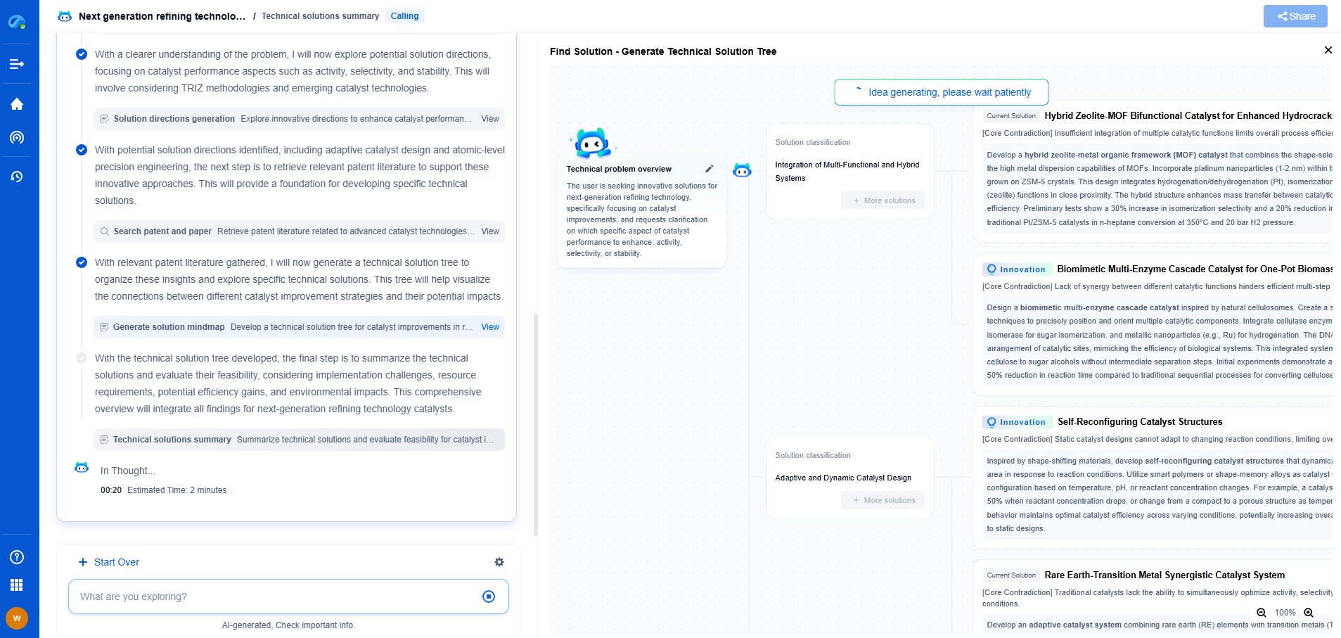
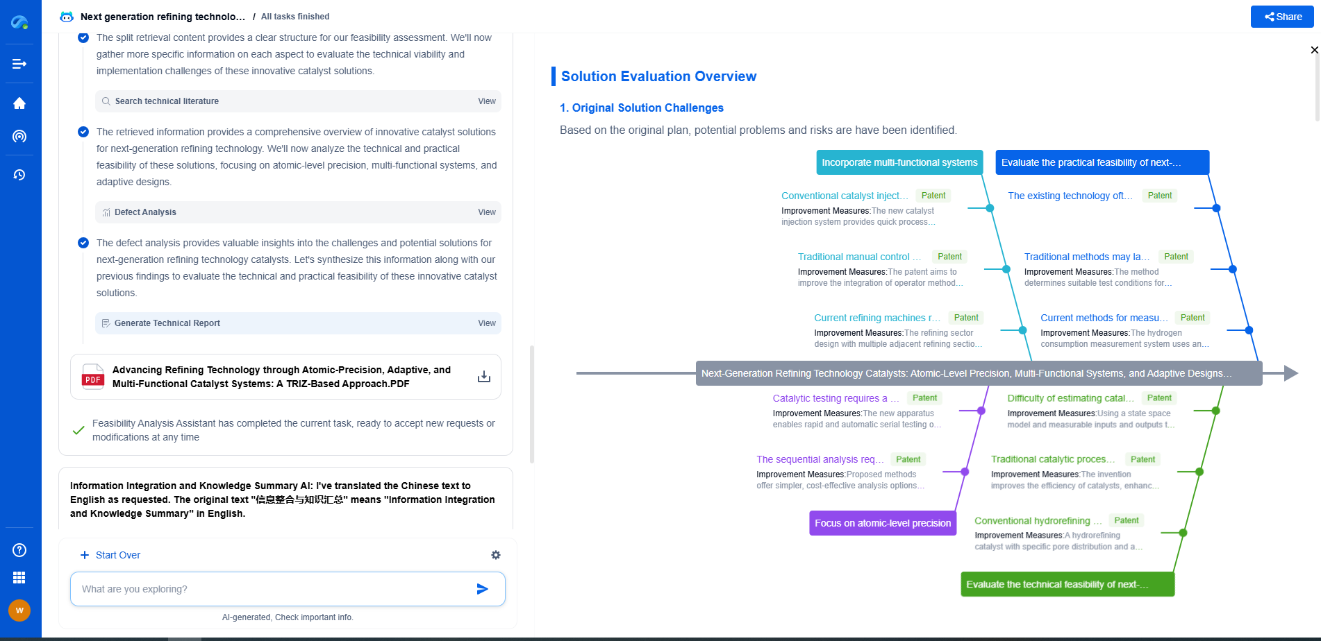
Whether you’re developing multifunctional DAQ platforms, programmable calibration benches, or integrated sensor measurement suites, the ability to track emerging patents, understand competitor strategies, and uncover untapped technology spaces is critical.
Patsnap Eureka, our intelligent AI assistant built for R&D professionals in high-tech sectors, empowers you with real-time expert-level analysis, technology roadmap exploration, and strategic mapping of core patents—all within a seamless, user-friendly interface.
🧪 Let Eureka be your digital research assistant—streamlining your technical search across disciplines and giving you the clarity to lead confidently. Experience it today.
- R&D
- Intellectual Property
- Life Sciences
- Materials
- Tech Scout
- Unparalleled Data Quality
- Higher Quality Content
- 60% Fewer Hallucinations
Browse by: Latest US Patents, China's latest patents, Technical Efficacy Thesaurus, Application Domain, Technology Topic, Popular Technical Reports.
© 2025 PatSnap. All rights reserved.Legal|Privacy policy|Modern Slavery Act Transparency Statement|Sitemap|About US| Contact US: help@patsnap.com

