However, a much discussed problem within the
mobile device and
wireless service industries is that the “
mobile Web” user experience on today's conventional pocketsize mobile devices (e.g. PDAs and smart-phones) is generally much less compelling, useful, and enjoyable than the “real Web” enjoyed regularly by nearly a billion people around the world on personal computers.
However, because of display and man-
machine-interface limitations of today's conventional pocketsize devices, most people consider the
mobile Web experience on today's conventional pocketsize devices to be clunky, constrained, tedious, and scraped-down compared to the real Web experienced on desktop and notebook computers.
This problem is contributing to much slower adoption of
mobile Web services than has occurred with mobile voice services over the last several years.
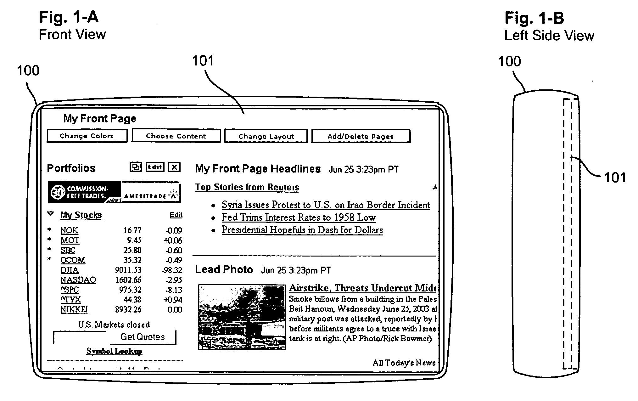
That leads to an unsatisfying Web browsing experience, because users have to constantly scroll to get to the information they want.
The low pixel count makes it hard for users to orient themselves and figure out where the information they want is hiding on a
Web page since they can only look at the page “through a
straw” (i.e. through a tiny window).
This is why, in a review of a popular brand of hand-held computer with a 24Ox320pixel display, in the Jul. 7, 2003, edition of eWeek, the reviewer noted that the device “still suffers (along with the rest of the hand-held browser world) from the fact that Web pages are not designed for low-resolution displays.”
But displays with pixel densities that high tend to make it very hard to read
Web page content (particularly text) when the content is simply squeezed onto those displays because some text can become too tiny to read comfortably, if at all.
Some device makers use larger displays that have readable pixel densities (well under 175 ppi) and plenty of pixels (sometimes 800×600 pixel or more), but their devices (which typically include buttons and controls on the frames surrounding the displays) are too big to be considered “pocket size”—well over 6 inches in width or height or both.
Each of the mobile devices above and all known conventional hand-held mobile devices today have some attribute that makes
Web access on that device uncomfortable for most people or that makes the device too big to fit comfortably in most people's pockets.
For example, the devices with displays whose pixel counts are 320×480 pixel or smaller simply cannot display enough of a
Web page: User's have to scroll too much, and they suffer from the disorienting “looking through a
straw” phenomenon.
The devices that are over 6 inches (in width or height) are too big to fit comfortably in most people's pockets.
More importantly, such a device is only 60% the width of a typical 800 pixel wide Web page.
That would certainly be better than trying to browse a Web page on a device with a 160×160 pixel or 240×320 pixel display, but our experiments (using
Web browser windows shrunk to various pixel dimensions) indicate that browsing with a 480×320 pixel wide display (let alone all the current devices that have even smaller pixel counts) is too limiting to allow for satisfying general
Web access over extended periods of use.
It still requires too much
scrolling and it still feels like “looking through a
straw” at the Web pages.
Several early mobile Web services failed in large part because potential subscribers did not find the service compelling enough given the limitation of conventional pocketsize devices, and they did not want to carry around non-pocketsize devices.
However, most
Web content is designed for much larger displays, and accessing shrunk or transformed versions of most pages leads to display or interaction problems (
ranging from ugly formatting to broken interaction features) and results in a
Web access experience that most people find far less satisfying than accessing the Web on a desktop or notebook computer.
That makes the Web pages uncomfortably small for most people, particularly when trying to read the text on most Web pages: Print on typical web pages appears exceedingly tiny on the PC-EPhone device.
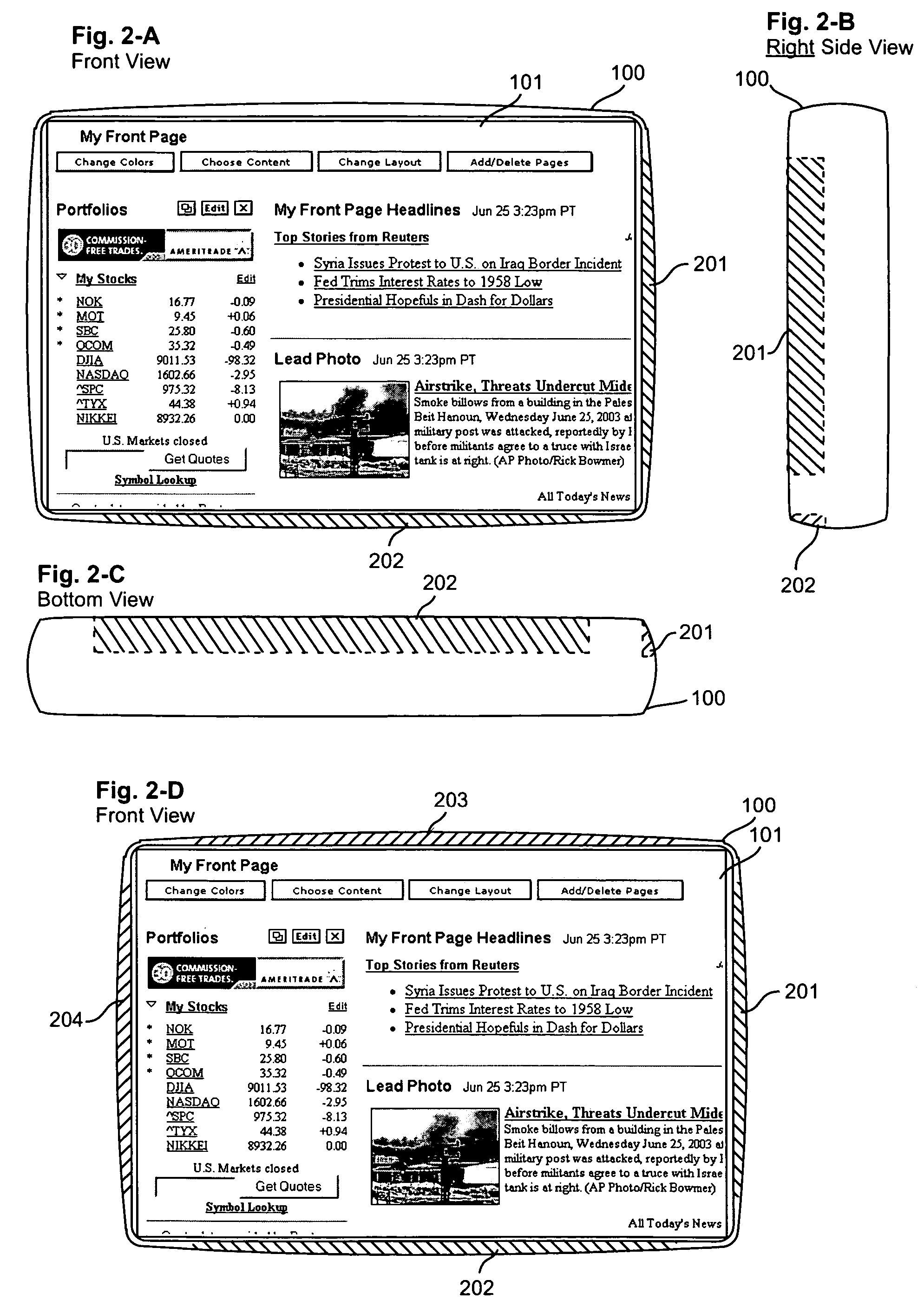
When a device only allows vertical
scrolling, then content that is wider than the display width (such as many Web pages) must be reformatted by the device or by a remote
server to fit horizontally onto the device's display, and such reformatting always changes the look of the page and often changes the behavior of Web page elements.
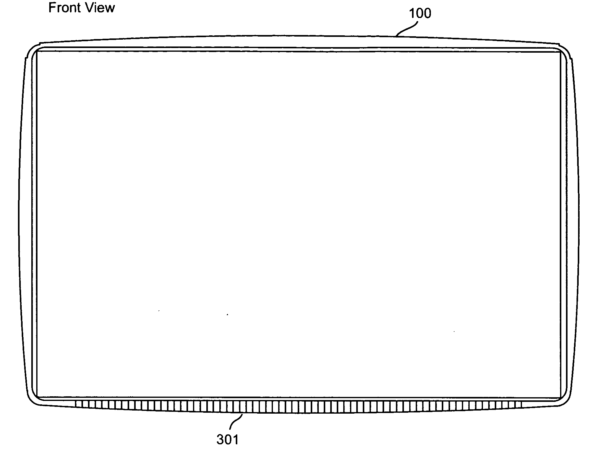
However, the DataWind's placement of the horizontal scroll controller along the top edge of the device (rather than the bottom edge) is inconvenient and unnatural to many users because, when holding a device that is wider than it is tall, such as the DataWind device, the user's thumbs tend to rest along the bottom of the device, not along the top of the device.

