. . technical constraints and design prejudices .
An appraisal of the prior art of control display identifies several weaknesses present in the prior art that lead to sub-optimum display and management of controls.
One such
weakness is inadequate provision for the user to easily consult a generally small screen area of specific interest while making selections from a control.
In general, it must be concluded that the positioning strategy employed by current GUI designers give inadequate attention to user benefits that follow from juxtaposing the control and the area of user interest.
Since the screen object clicked is likely to be the area of current interest this display position often results in
overlay of a portion of this area.
Ideally the work-area and area of current focus coincide but exigencies of a user task do not always make this possible, as is elaborated later.
. . users expect certain aspects of the interface to behave in certain ways, and when this does not happen, it can be very confusing."
336-338) employs this approach but, as shown below, not in a manner that assures minimization of work-area overlay.
Another issue of concern with the prior art is the presumption implicit in the pull-down menu design that the
usability of controls displayed in tiled format; i.e., multiple windows displayed in a manner such that no window overlaps another, is superior to alternate formats.
Another class of limitations of the prior art relates to how users of different skill levels navigate within the current control and between the different controls.
Skilled users tend not to make many errors, but do find a control unfriendly if it fails to satisfactorily meet their needs for efficient control navigation.
Novice users make frequent errors as they navigate controls because of uncertainty regarding services available, specifics of individual services, or the path to a desired service.
However, if users normally select a single option from a control, a design that requires an explicit performance of "Done" after each selection will not be considered particularly user-friendly.
The second conundrum arises when control designers decide that users will typically make a single selection from a control when in actuality users typically make multiple selections.
This imposes a greater burden on the user than imposed by the burden of terminating a multi-selection capability when single selection is performed.
The third conundrum, not been fully resolved by the prior art, arises when users variably utilize a control for single selections and for multiple selections.
Other experts will contend that users commonly dislike control management that requires engaging one hand for what may be a protracted period.
An unresolved problem of the current pull-down display is to permit continuance of tiled display when non-menu controls such as the
dialog box are to be displayed.
Rather than resolving this problem, the prior art typically ignores it by removing all menu controls before displaying a non-menu control.
Requiring the user to regenerate the control path for this reason is undesirable because it lowers productivity and makes learning the structure of interrelated controls more difficult.
Closely related to failure to provide full reverse
traverse are limitations in the way the prior art provides the
undo capability.
The preceding review of the prior art of control usage reveals that
usability problems fall into the categories of better positioning of the control display, better formatting when multiple controls are displayed, and the need to offer more user-friendly methods of control navigation.
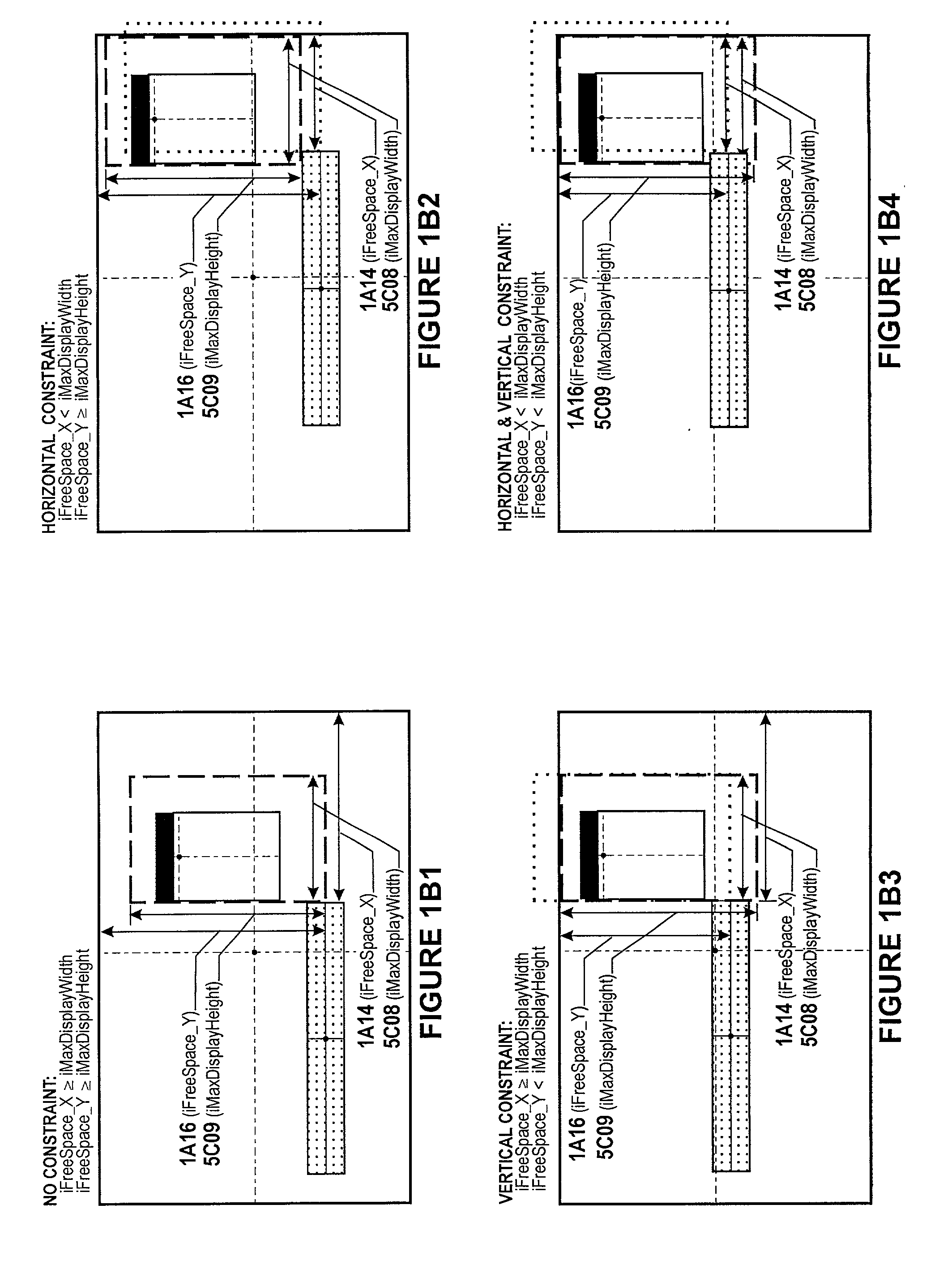
Under circumstances where the work-area is large and located near the display-zone center and with dimensions of the selected control greater than the dimensions declared for the maximum display, the control positioning procedures here disclosed may result in clipping of the control display.
The Sun
algorithm positions the control relative only to the work-area, which does not assure a control location that guarantees maximum
free space.
Microsoft Windows and IBM OS / 2 appeared shortly thereafter but did not initially support overlapped windows.
First, toolbars frequently do not have descendants and when descendants do occur commonly present fewer options than does the parent.
An implication of this is that under certain circumstances it is possible that a currently displayed control can appear excessively far from the work-area.
But because the menu controls will be centered on the fixed-point and have small dimensions, they may appear excessively distant from the work-area.
Such an action, to a greater or lesser degree, violates Hix's Principle of Least Amazement and must be considered undesirable.
Reference to the literature cited communicates that the prior art of
undo does not offer user-friendly mechanisms that initiate the undo of arbitrary services performed during the current Control Subsystem activation.
FIG. 4A does not disclose the ordering and repetition of activities permitted during user manipulation of the Control Subsystem.